The Pulse report provides an overview of the performance of a single, selected page of your Site. It's a great starting point for identifying potential speed issues and improvements over time.
Switching pages#
- Click on the page name in the top section of the page.
- Select the page you'd like to view a report for. Your Pulse report will be updated accordingly.
Inspecting Web Vitals#
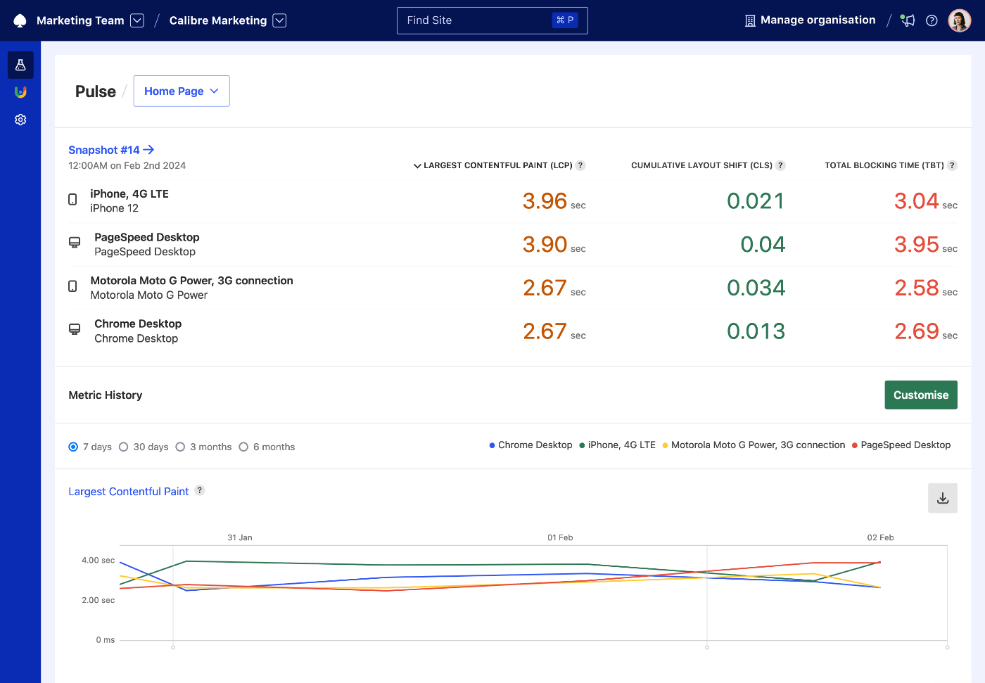
At the beginning of the Pulse report, Calibre displays Web Vitals (Largest Contentful Paint, Cumulative Layout Shift and Total Blocking Time) for the most recent Snapshot and all of its Test Profiles.
The metrics encompass a median aggregate of all Pages for the Site and selected Test Profile, so you can get an overall picture of performance differences across different test settings. You can sort by metric value by clicking on the metric name in the column header area.
Viewing and customising metrics#
By default, Calibre shows 7 days worth of history for selected metrics, which can also be changed to 30 days. You can also view up to 6 months data on the Metric page. Each metric's history can be exported directly from Pulse.
To customise metrics on the Pulse report in the Metric History section:
- Click on the Customise button.
- Select (or unselect) metrics you’re interested in.
- Drag to reorder selected metrics.
- Click the Save button. Your Pulse report will be updated immediately.
Can I view more metric history than 30 days?#
Yes. Clicking the name of the metric above the chart takes you to the Metric page, which visualises up to 6 months of metric history. Calibre stores metric history from the start of your subscription, even if it’s not visualised on charts. You can access the full history using our APIs. We're currently working on upgrading our charting and making the entire metric history available in the interface.
Does the metric customisation work for my entire team or organisation?#
When you customise metrics on Pulse, the settings are saved for you only. In the future, we might introduce a way of setting key metrics persisting for teams and organisations.
Analysing metric charts#
Each metric chart can have multiple, coloured lines corresponding to Test Profiles set up for the Site, so you can quickly identify which areas need most improvement.
If you enabled Deployment Tracking, the charts will also have vertical lines signifying each release, so it’s easy to identify the correlation between speed changes.