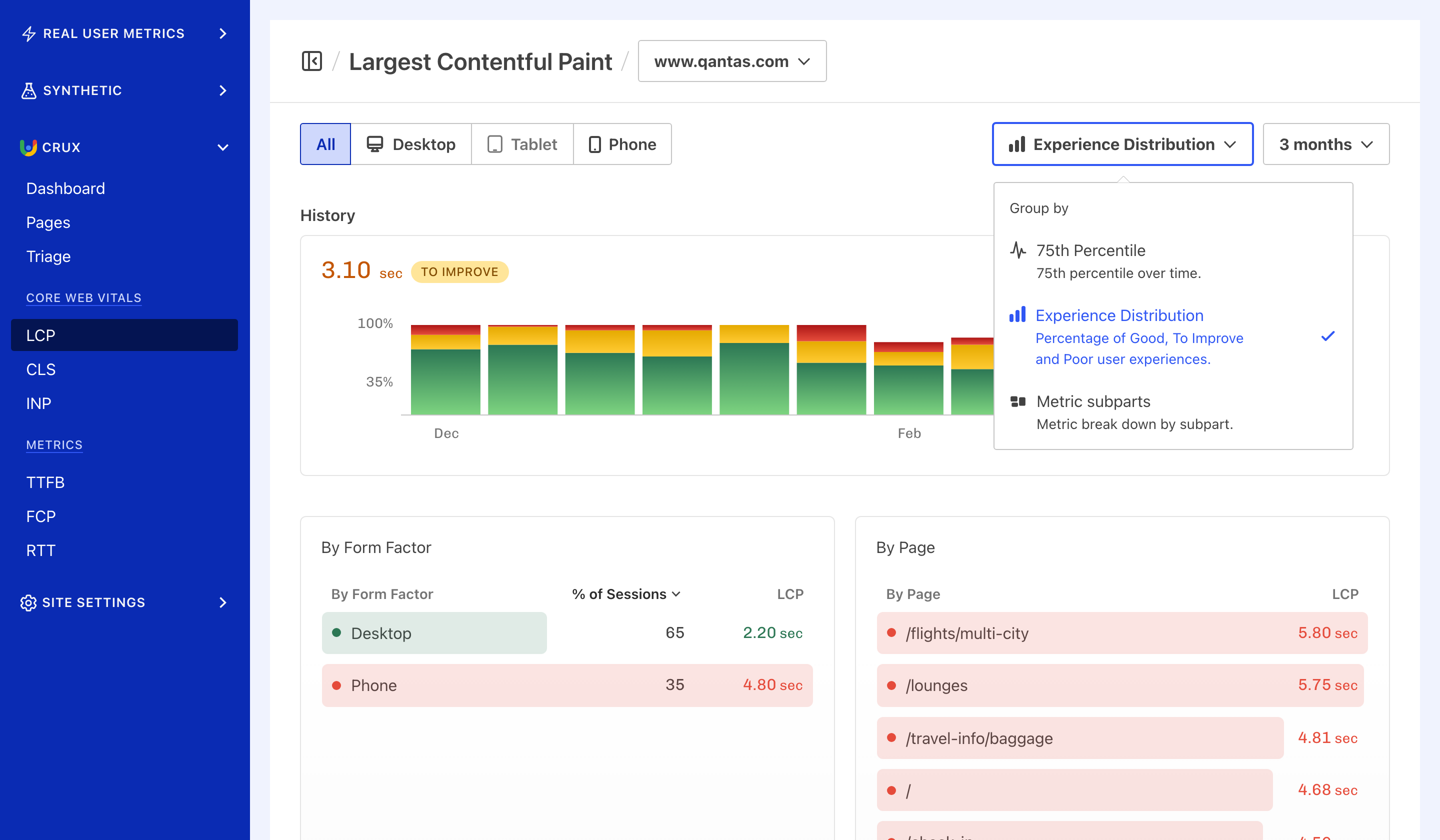
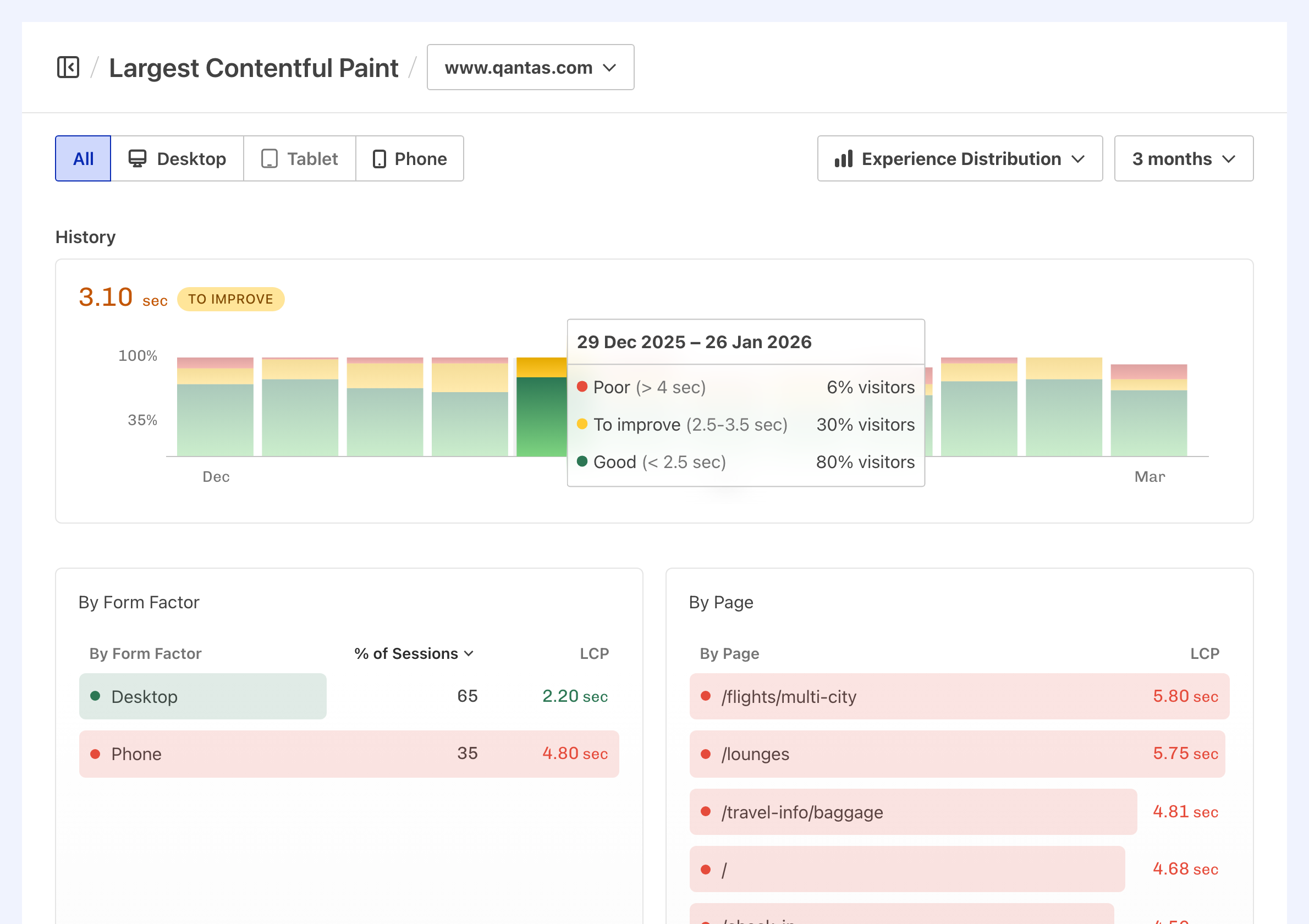
Experience Distribution helps to easily visualise how many percent of your audience have a good, needs improvement, or poor experience while browsing your website or application, and track it over time.
Display Experience Distribution#

- Navigate to CrUX → Dashboard or any Core Web Vitals or Other Metrics page.
- Select grouping by Experience Distribution in the upper right hand side corner.
Experience Distribution grouping#
Experiences are grouped accordingly to recommended values for each metric into three buckets:
- Good: indicating a likely positive user experience, colour-coded in green.
- To improve: indicating a subpar user experience, colour-coded in yellow.
- Poor: indicating a negative user experience, colour-coded in red.

Alongside metric values for each range, Calibre displays a percentage of your audience with each user experience type. It's important to track how Experience Distribution changes over time, to ensure the maximum number of users have a positive perception of your brand.