Metric pages for all Core Web Vitals (Largest Contentful Paint, Cumulative Layout Shift, Interaction to Next Paint) and Web Vitals (First Contentful Paint, Time to First Byte, Round Trip Time) provide a detailed view of each metric, helpful in diagnosing specific issues.
To view, navigate to Site → CrUX → [Metric Name], or click any metric from the Dashboard.
Use metric pages when you need to investigate a specific performance issue in depth, view trends over longer periods, or compare how a metric performs across different pages and form factors.

If a metric is at risk of exceeding (or exceeds) a distribution threshold, a line will be displayed on the chart to show the boundary value. The image above showcases a yellow line when LCP temporarily changed from "good" to "to improve".
Filter by device type#
To explore how Core Web Vitals measurements change depending on the device used, choose a type from the following options:
- All (aggregate of all devices)
- Desktop
- Tablet
- Phone
It's possible that data for a selected device is not available for a given Page in the CrUX API. If the data is available, Calibre will display the percentage of contributing sessions for each device type when hovering over the filter element.
Change chart type#
Depending on what your goal is, you can switch between two types of visual representation:
- 75th Percentile: a bar chart portraying how the P75 value for each Core Web Vital metric changed over time. This mode is useful for analysing trends.
- Experience Distribution: a stacked bar chart portraying the proportion of good, poor and needing improvement user experiences. This mode is useful in analysing if the majority of sessions happen without performance issues.
- Metric Subparts: a bar chart showing the individual timings that make up the Largest Contentful Paint metric, useful for understanding which part of LCP is causing delays.
Each bar in both types of charts represents a week of data collection period, and is updated weekly.
Change reporting timespan#
To explore trends in a selected metric, you can choose between 3 and 24 months duration displayed on each metric chart.
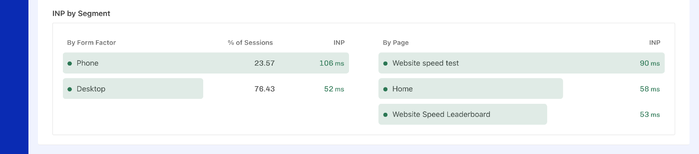
Metric by segment#
Additionally, for each metric, you can view:
- By Form Factor: a percentage of sessions split between phone and desktop with 75th percentile metric value for each.
- By Page: a list of tracked pages with 75th percentile metric value for each.