

Happiness score, experience score, or performance score—many have tried to distil people’s experience into a singular number (which, in performance case, has serious downsides).
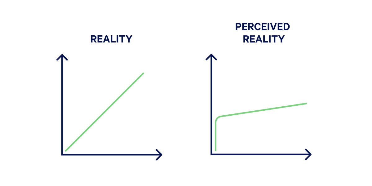
But is it even possible to boil down human perception to a single number? What’s the gap between measured and perceived performance, and which one should we use as our goal?
What is perceived performance?#
Perceived performance refers to how fast or responsive a website or app feels compared to how fast or responsive it is, as reported by metrics. Where metric-driven performance relies mainly on development improvements, managing perceived performance is a combination of design choices, and leveraging the psychology of how people perceive time and speed.
Because perceived performance is subjective and dependent on external factors (what is the setting, someone’s browsing a site in? What device are they using? What’s their network like? What’s their emotional state?) it’s notoriously challenging to quantify.
Despite this complexity, there are a handful of guiding questions we can ask to help determine if the perception of speed will have a positive sentiment:
- Is the response to input delayed?
- Is there any flickering or sudden page movements?
- Is imagery loaded in high quality?
- Are videos playing without unnecessary pauses?
- Are the animations smooth?
- Are there signs of intensive processing (device battery depletion, unresponsive browser or app, fans spinning up)?
While performance measurements are indispensable, how responsive people perceive our user interfaces to be should be the north star for prioritising speed efforts.
Before we can get into actionable advice on how to work with perceived speed, we need to learn the basics of how people understand time and what affects its perception.
How do people perceive time and speed?#
Time might be a scaffolding for our life, but it’s a subjective and ever-changing concept. Accordingly to numerous studies, our time perception can be altered by emotional state, age, whether we’re bored, craving something, or our culture. Ever heard of “time flies when you’re having fun” or stared down a pot of water waiting to boil? Then you’ve already experienced how we feel time expanding and contracting.
Since time is highly subjective, we need principles to guide us in knowing what “fast” means, what it depends on and how we can deliver it for everyone. One commonly invoked principle in the field of psychology is the Weber-Fechner law, which defines the Just Noticeable Difference (JND) in response to stimulation.
Research indicates that we can only notice a change of more than 20%.
In the web performance context, this means aiming for improvements well above the 20% threshold. This number doesn’t mean that smaller, cumulative improvements don’t count, but provides us invaluable information about what human perception is like.
We’re also better at detecting small differences in time in shorter, rather than longer intervals. Especially when performing routine, quick tasks, we will be more affected by delays. That points us to optimising actions people perform most frequently within our sites and apps, such as adding to cart, the checkout process, or create, read, update and delete (CRUD) actions.
Moreover, our timeliness expectation is tightly tied to how complex the interaction is supposed to be. The more complex the task we’re performing, the more forgiving we might be of delays:
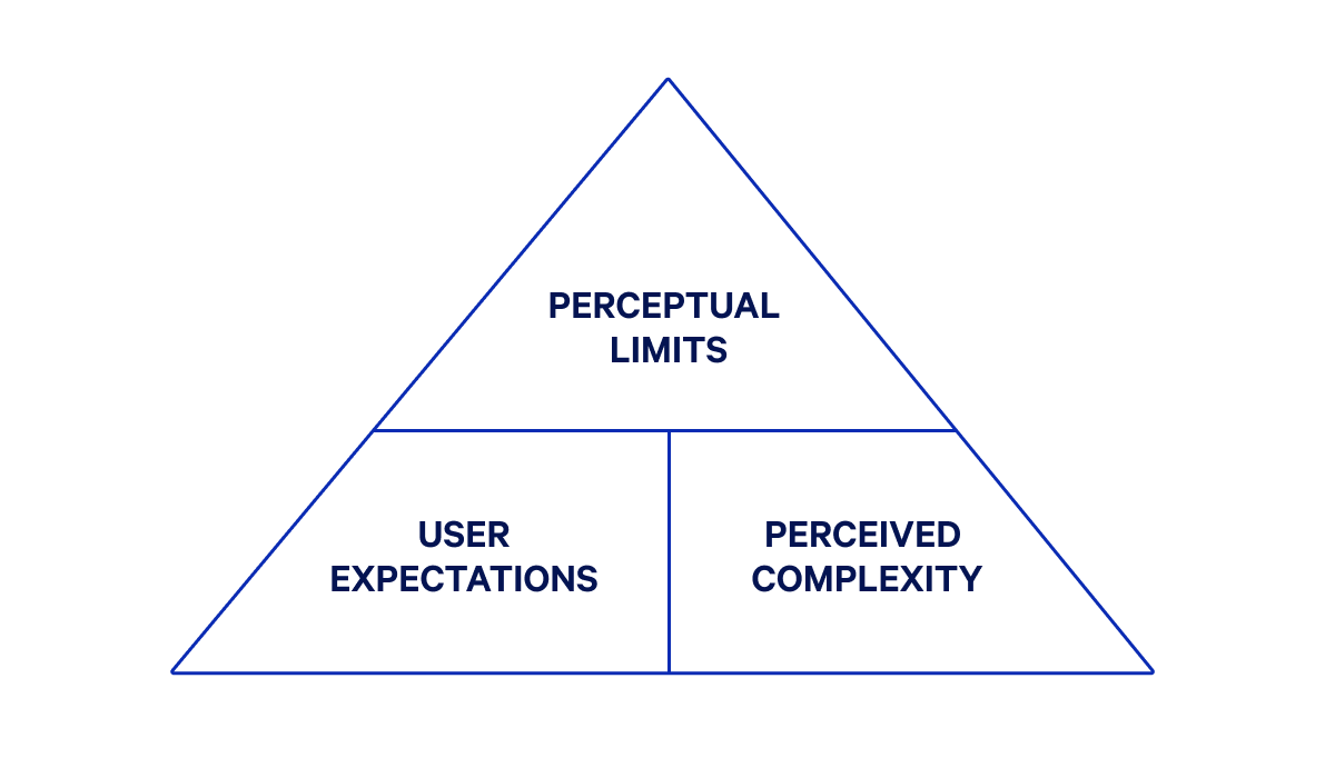
Our expectation is also tightly tied to different modes of input (mouse, keyboard, speech, etc.) and interface feedback (sound, visuals, or haptic). We’ll have different expectations depending on how they use the web and what feedback we receive.
How we perceive speed also connects to the idea of flow. In the 1960s, psychology professor Mihaly Csikszentmihalyi established the definition of flow:
[Flow] is being fully absorbed in activity—it’s a natural state of being productively engaged with a task without being aware of underlying technology.
When website or app performance enhances the feeling of flow, we’re more likely to have a positive sentiment about its performance.
When talking about feeling focused on a task, how do we quantify the timeframes for maintaining flow? Many cite Jakob Nielsen, who specifies three limits (0.1 second, 1 second and 10 seconds) to human attention. While this simplification might be useful to some, there’s a difference between “instant” and “immediate” and between “attentive” and “non-attentive” spans (which you might call passive and active).
Bucketing timeframes by attention span (based on Steve Souw’s definitions and research by Rina A. Doherty and Paul Sorenson) proves more useful when assessing performance depending on length of the operation and perceived complexity:
| Attention | Category | Response time | Description |
|---|---|---|---|
| Attentive | Instantaneous | below 300ms | Perceived as closed-loop system, where people are in direct control. |
| Immediate | 300ms–1 sec | Perceived as easy to perform. | |
| Transient | 1–5 sec | Perceived as requiring some simple processing, but people still feel like they are making continuous progress. People are unlikely to disengage from task flow. | |
| Attention span | 5–10 sec | Perceived as requiring more wait time. People need informative feedback to stay engaged. | |
| Non-attentive | Non-attentive | 10 sec–5 min | Perceiving as requiring more complex processing. People are likely to disengage and multi-task. |
| Walk-away | above 5 min | Perceived as requiring intensive processing. People won’t stay engaged with the task. |
While the non-attentive times are far more generous, this doesn’t mean we should stop aiming for as low thresholds as possible. What they do is give a more granular distinction between attentive and non-attentive spans. We can then use this information to design flows depending on the duration of an action, provide appropriate, timely feedback and prioritise performance work.
There are dozens of other heuristics, laws and principles on time perception, which we aren’t going to cover. But what the above information gives you is an understanding of:
- minimum difference we can perceive
- the role of context, complexity, and expectations in perception
- state of flow and its impact on performance sentiment
- attentive and non-attentive time ranges and how to address them in design decisions
4 ways to improve perceived performance#
1. Be smart about communicating status and progress#
We know that providing feedback can decrease user’s perception of wait-time and associated stress. One of the most common cases where feedback is necessary is following an interaction, especially when the response takes time. The more timely status and progress updates we give, the more control and certainty people have while browsing.
Managing these updates often includes loading indicators. To truly make every interaction feel snappy, we should choose them based on the context of the length of the response time and predicted wait time for an action to be completed:
| Load time | Wait time | Strategy |
|---|---|---|
| below 1s | - | No loader needed |
| 1–2s | - | Skeleton screen or localised spinner |
| 2–10s | Fixed | Time indicator |
| Open-ended | Progress bar or step indicator | |
| above 10 s | Fixed | Percentage indicator or background process indicator |
| Open-ended | Notify people when task is complete |
There are also additional considerations for loading indicators, besides choosing the right type for wait time:
- Optimise animations: When adding animations to longer loading states, optimise them so that the animation itself doesn’t affect performance. You can learn how in our guide to animation performance. Also, opt-in for a pulsing or looped animations that give the impression of acceleration.
- Be careful about skeletons screens: They have become somewhat ubiquitous with the rise of JavaScript-driven sites. If they’re the only viable option, ensure they match the real user interface. Otherwise, they will produce jarring shifts. Ensure that they show incremental progress versus suddenly flashing a ready page (which will result in a sub-par CLS measurement).
- Localise loading spinners: Spinners are best used when only a small page element will change. Avoid using a spinner when entire pages or screens are loading, as it makes people focus even more on the wait time.
- Write good copy: No interface treatment will be a substitute to short, clearly understood messaging. Accompany loaders with meaningful copy, or opt for text-only status updates instead.
Appropriate communication of status and progress helps manage expectations and soften the effect of delays we can’t optimise. You can use paint metrics (such as Largest Contentful Paint, First Contentful Paint) and runtime metrics (Interaction to Next Paint) to assess loading, but they won’t replace step-by-step, visual testing.
2. Always have something for the reader to do#
Visitors are never more aware of how long a page takes to load than when they have nothing to do. Luckily, there are a few strategies you can use to make sure people’s attention remains occupied, and doesn’t drop off:
- Use loading messages: If delays are likely to be multiple seconds, add written content—like rotating quotes, statistics, or tips on how to get more out of your product. You might also consider something fun, like the well-known dinosaur game available when the Google Chrome browser is offline.
- Lazy load off-screen content: Defer the loading of certain elements so that the page becomes usable quickly. Readers can start exploring your content while the remaining elements load in the background. Lazy loading should be implemented carefully, as with large datasets or improper priorities, it might cause performance issues rather than gains.
- Free people to continue working: For really long tasks that could take minutes, you don’t want your visitors to actively wait. Instead, process what you need to in the background while allowing visitors to do something else. For instance, if your signup process involves an extensive analysis, start that right away in the background. While the task is processing, ask visitors to continue filling in signup details. This way, the process should be ready for them when they’re done with signup, and it won’t feel like they’ve wasted any time waiting. What’s important in this strategy is clearly setting expectations about processing times, which might involve notifying people when action is completed.
Implementing these improvements means being aware of when visitors will likely be waiting. Make sure to track load times for all your pages and analyse the most common behaviours and actions, so you can implement optimisations where they’re most needed. Similarly to the first strategy, this approach helps us meaningfully manage delays.
3. Avoid sudden page movements#
Sudden page movements are the bane of online existence. It’s frustrating when you click a menu item, and it suddenly shifts up or down a substantial amount, resulting in landing not where you intended to. These shifts also destroy any illusion that your site is loading quickly, showing that the page is still very much a work in progress.
Shifts happen for several reasons. To optimise how pages and their building blocks render:
- Avoid late injected JavaScript: New elements appearing or existing ones shifting on a page that already feels settled results in a jarring effect for readers. Have a look at request priorities and the rendering videos for your page to find where you can improve.
- Add dimensions to media: One of the most common reasons for sudden shifts is the lack of dimensions added to images, videos, ads, iframes, and embeds. Make sure these elements have defined sizing and are served with the appropriate quality for the audience’s devices.
- Optimise webfonts: Both Flash of Unstyled Text (FOUT) and Flash of Invisible Text (FOIT) account for text loading-related shifts. Use CSS and HTML attributes and the Font Loading API to guarantee content is promptly available.
Luckily, unexpected movement is something we can test and address, thanks to the Cumulative Layout Shift metric. You can find actionable strategies for avoiding sudden page movements in our Cumulative Layout Shift guide. You can also quickly check CLS in Core Web Vitals Test for free. Avoiding sudden page movements helps us communicate reliability and readiness of a site—all critical to perceived performance.
4. Prevent intensive processing#
Spinning fans, hot battery, and a blank or unresponsive page—all hallmarks of the browser struggling to render a requested page. When things go awfully wrong like this, the perception of the service (or brand), as well as our trust, are already negatively impacted. Fortunately, we have well-tested strategies to prevent those situations:
- Ship less JavaScript: JavaScript is the most resource intensive asset; the less we use it, the more we limit potential speed and UX issues. While we have strategies and tools for bundle optimisation, the best results will be accomplished by decreasing the amount of executable code. If that’s not possible, we recommend addressing JavaScript long tasks as an addition to bundle optimisation.
- Audit third-party impact: It’s not uncommon to see 30-50 third-party services per page, which will have a significant impact on performance. If you’re using Calibre, you can access a Third Party Report to easily track how third parties contribute to page size and execution time, as well as audit which ones stand in the way of great performance.
- Use interface facades: Facades are an approach of implementing static representations of third-party embeds to defer load until they’re actually needed. When done correctly, the facade makes people feel like the entire page is ready without impacting their user experience with slower load times caused by a third party they might not need. As an example, check our open source library using facades for support chat widget.
Reducing and optimising script resources prevents the signs of intensive processing and reduces the possibility of delays. We can use Interaction to Next Paint and Total Blocking Time to quantify and track these efforts.
Great performance and design go hand in hand#
When people mention web performance, they usually focus on development-first aspects like JavaScript frameworks and performance metrics. These are all important for creating a better experience for your visitors—but smart design, rooted in behavioural psychology, also has its role in creating better UX and performance, perceived or otherwise.
To learn more about how you can design your site for better performance, subscribe to our Performance Newsletter.
This post is also available in Hebrew, thanks to Alik Zem. לקריאת הפוסט בשפה העברית