
Image optimisation is often the first step in a person's web performance and page speed journey. It's a relatively easy fix with potentially high rewards. Optimising a single image isn't complicated or time-consuming, and it could equate to site speed gains, better UX, and noticeably improved Core Web Vitals.
It's no wonder that there are numerous articles designed to help people optimise their images more efficiently.
Many tools can help you optimise images (some of the best ones are outlined below). However, because image optimisation is often taught to beginners, explanations of how to do this often skip over many crucial details needed for the best results. You'll need to know more to ensure your images are as optimised as possible. This guide will provide learners of all skill levels with advice in image optimisation built up from years of working in the web performance field. This way, you can understand what an adequately optimised image is, why it’s important, and how you can squeeze every bit of performance out of the images on your website.
What is image optimisation?#
Image optimisation is configuring images on your website to provide your visitors with the best possible experience. A well-optimised image should:
- Be a high-quality visual aid that has a functional purpose within your content.
- Have an appropriate file type and file size that balances performance with image quality.
- Fit into a page perfectly without resizing or layout shifts, regardless of the screen it’s being viewed on.
- Be loaded, so it doesn't delay the rendering of other critical resources on your page.
These four criteria for a well-optimised image are ordered from most to least complicated. If all you can do is the first two, that's not a problem. Even removing or changing images that aren't adding value is enough to speed up your best pages.
Why is image optimisation important?#
Images are crucial to establishing a brand and portraying ideas, people, and products. Yet, images remain among the most significant contributors to bad performance and user experience. In May 2022, the median weight of a desktop page was 2.3 MB. Of that 2.3 MB, around 1 MB (or 43%) of the page load was images.
Because images make up so much of the page-loading process, any optimisations you make to slim these down or deliver them more efficiently equate to significant speed gains. It's essential to keep your pages speedy because page load time directly impacts conversion rates. One recent study found that conversion rates increase by 17% for every second you shave off page load times.
Despite being a source of lower page speeds, images are still necessary resources on most pages. Sometimes it’s just not practical or efficient to describe something solely with words. Images give your readers a visual aid that helps them understand the complex subjects or processes you’re talking about. For this reason, ensuring that every image you create is optimised so your page balances the need for powerful imagery and lightning-fast site speed is necessary.
What tools help with image optimisation?#
There are a lot of tools out there that claim to help you keep your images optimised easily. Knowing what these tools do and what you need to consider when evaluating which ones you'll choose is helpful.
Image compressors#
Image compressors take image files and reduce their size while keeping image quality high.
There are two kinds of image compressors: lossless and lossy. Lossless compressors reduce image size while not affecting image quality at all. They remove metadata within the image file while leaving the actual image data alone. In contrast, lossy compression allows you to shrink image files even more at the expense of image quality.
Image compression is something every website should do, as it’s an easy way to reduce image file sizes. To pick the right one for you, you'll need to decide whether you want a compressor that requires you to do images one at a time or automatically integrates with your systems.
A basic drag-and-drop compressor will be the right choice if you’re running a smaller website. Some basic image compressors include:
- ImageOptim: Native MacOS drag-and-drop compressor
- Trimage: Native Linux drag-and-drop compressor
- FileOptimizer: Native Windows compressor
- Squoosh: A browser-based drag-and-drop compressor
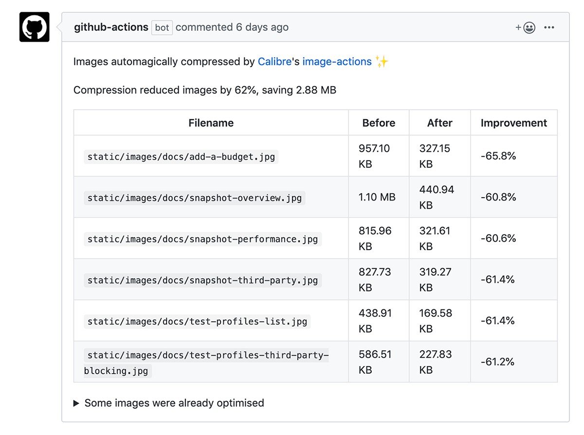
For people looking to compress large numbers of images, you'll want a compressor that automatically does the job. If you’re a GitHub user, we've built an image action that will automatically compress images on all your Pull Requests. It's straightforward to enable and will take care of many headaches connected to building an automated system.
Content Delivery Networks (CDNs)#
CDNs are networks of geographically distributed servers that make it easier for you to deliver your images because they guarantee a server is close to your visitor's location. The closer your resources are to the people requesting them, the faster the download will be.
Beyond just faster image delivery, CDNs also help you by:
- Taking some of the bandwidth stress off of your servers.
- Making your site more capable of handling large numbers of visitors.
- Reducing image file sizes by including image compression and minification before delivery.
- Caching your content for faster delivery.
For better image optimisation, you'll also want to look at a specialised image CDN, which can work in concert with a more general CDN service.
Image CDNs improve image delivery speed by:
- Resizing your images automatically.
- Converting images to the best image format on the fly.
- Cropping larger images automatically focuses on the central point of your image.
Best of all, they don’t require any work from you. All you have to do is pick the right CDN for your business.
When picking an image CDN, you should consider:
- Price: There are free image CDNs, but they may offer little control, reliability, or support.
- Features: Some image CDNs allow for more customisation or supported image file types. Make sure you pick one that does everything you need it to.
- Integrations: Many image CDNs can be integrated with your CMS for a seamless image optimisation experience.
- Speed: Make sure this image CDN delivers your images quickly for a better user experience on your site.
- Service: Check online reviews to see how people are treated by their customer service.
Since many of these factors come down to your situation, it’s nearly impossible to tell you what will work best for you. However, if you consider each CDN through the lens of the above factors, you should be able to find one that suits your specific needs.
How to fully optimise your images#
Tools only get you part of the way when it comes to image optimisation. These steps will help you ensure that your images are all as optimised as possible.
1. Make sure images are functional for everyone#
You first need to make sure that all your images serve a functional purpose on your page. This doesn't mean that all your images must be graphs or charts. However, they should help your readers by supplementing what's in the text.
For instance, a picture of the view from your hotel can help prospective visitors understand what they're getting if they book a room. However, if the same page only has a stock photo of Paris, that's simply window-dressing and not helping visitors.
Remove or replace all images that don’t meet the threshold of serving a function on the page. Removing these images automatically boosts page speed, and if they serve no functional purpose, your readers won’t miss them.
Once you've decided which images will stay, provide descriptive alt text for each image. Alt text helps people with visual impairments understand what's in an image. This way, all your visitors get the benefit of your visual aids.
2. Choose the right format#
Choosing the suitable image format is a big part of the eventual file size the image will have. Image formats significantly impact file size, quality, scalability, and compression options.
There are a lot of technical intricacies in image compression and quality control, but you can effectively navigate the selection process without diving in too deeply. Here are the most popular formats with their use cases:
| Format | Best For | Transparency | Animation |
|---|---|---|---|
| JPEG | Photos and screenshots | No | No |
| PNG | Images with fewer colours (256 colors for PNG-8) or partial transparency(PNG-24) | Yes | No |
| WebM or MPEG-4 | Animation and motion | Yes | Yes |
| SVG | Simple geometric shapes or vector illustration | Yes | Yes |
| AVIF | Next-gen image format that can replace WebP, JPEG, GIF, and PNG | Yes | Yes |
While GIFs have been popularised for animation purposes, a more performant way to explore motion is to either animate SVGs or record a video in WebM or MPEG-4. GIFs are incredibly heavyweight (latest example in the wild; 30MB for a single image!), while a video can be hardware accelerated, resulting in smoother playback and better colours and compression.
Two new image formats, WebP and JPEG XR, can introduce significant bandwidth savings (25-34% in the case of WebP). However, these next-gen image formats aren't supported in all browsers yet, so it’s best to use them with fallbacks in place (or with the help of image CDNs).
3. Replace icon fonts with SVGs#
Icons are widely used, even more so in product design. Numerous Open Source icon frameworks and libraries are available free of charge, which further popularises icon usage.
There are multiple ways to implement icons—two of the most popular are icon fonts (where we use a font file that contains icons as glyphs) and SVGs (scalable vector graphics). Icon fonts are widespread, primarily due to ease of implementation and use. However, they cause both speed and accessibility issues.
Icon fonts are counted as fonts; therefore, visitors are presented with nothing or a cryptic missing character glyph when the icon font fails to load. They also cause significant issues for assistive technologies (imagine screen readers pronouncing complete nonsense to try to portray the icon without appropriate descriptors and HTML tags).
From a speed standpoint, the difference between icon fonts and SVG files can often be minor and hugely dependent on context (number of icons and how they're implemented in code). However, weighing up accessibility and scalability and being prone to failure, SVGs have a significant advantage.
When creating iconography, consider your context—how many icons will there be and whether their styling and sizes are adaptable. If implemented correctly, SVG iconography is fast, reliable, and, more importantly, semantic and accessible.
4. Compress your files#
Depending on context and familiarity with developer tools, there are many ways to handle image optimisation. Even if coding isn't your cup of tea, you can still ensure your images are compressed.
If you’re working on smaller projects, run each image through a drag-and-drop optimisation tool (like some of the ones outlined above). Since the process of optimisation is manual, this works better for smaller projects that aren't updated frequently.
For either larger organisations with multiple projects or applications heavily relying on imagery (Airbnb, for example), it’s necessary to implement potentially complex automation scripts or consider image CDNs. These solutions have implications in development scope and often a hefty price tag but are worth discussing with your team if images significantly contribute to poor performance.
5. Design for image responsiveness or use a CDN#
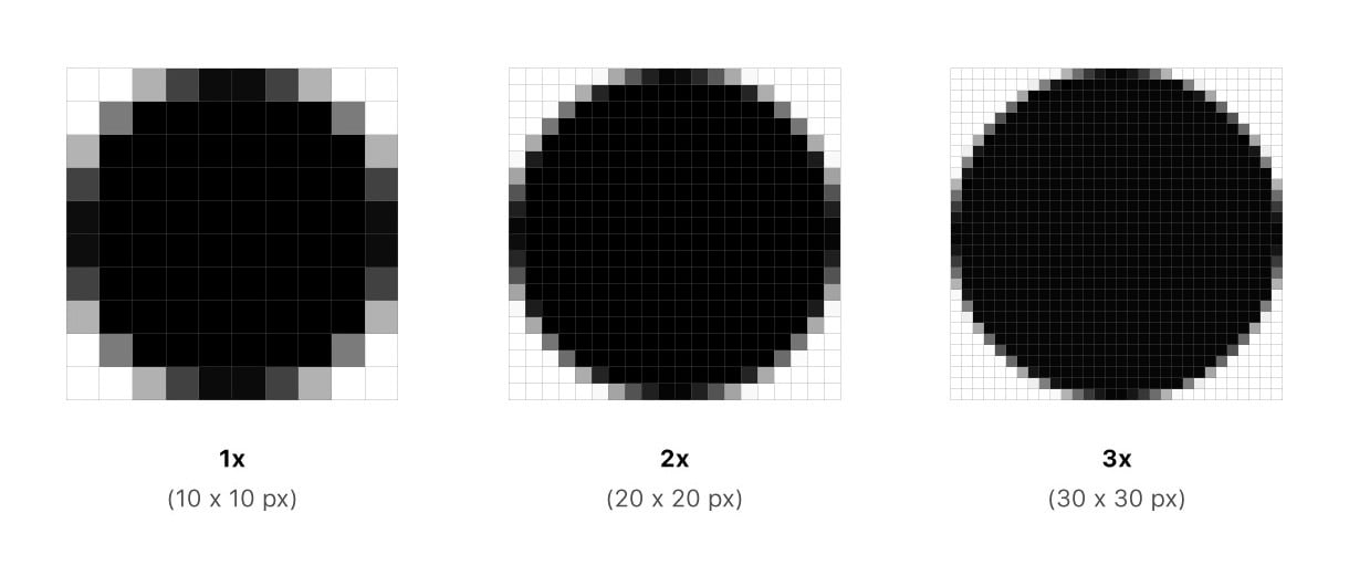
In the age of responsive web design, images must cater to various devices and screen sizes. Shipping too big images is a widespread problem (mainly when primarily catering to Apple's Retina displays versus lower resolution devices). When you serve images that are bigger than they need to be, it increases browser parse time and makes scaled graphics look blurry.
There are several decisions you can make in addressing this problem. The first one is determining how imagery is going to behave when the viewport changes:
- Is the aspect ratio constant or variable?
- Is the imagery going to be cropped?
Another consideration is the pixel density on device screens. With density varying from 100% to 300%, it’s relatively easy to mishandle. The same imagery might look vastly smaller on high-density screens and larger on low-density screens. To control media and ensure their highest quality, you need to provide appropriate dimensions and pixel density.
A common solution to handling responsive images that you might explore with your team is image CDNs. Image CDNs make creating responsive images a breeze while also introducing significant speed gains.
6. Add placeholders and skeleton screens#
Site speed is essential, but so is perceived site speed. Even giving your readers a hint that content is indeed loading can improve UX.
One way to improve this speed perception is to leverage skeleton screens. Coined by Luke Wroblewski, skeleton screens indicate that content is loading and will eventually appear. They're implemented by presenting a rough wireframe of layout and elements on a page, often with a subtle, relatively fast animation.
Work with your development team to identify which parts of the application are unusually slow, whether because of being image-heavy or data-rich. Then, design appropriate interface simplifications that'll hide, delay, or partially render interfaces to create an impression of speed. This strategy spans further than imagery and can be leveraged for entire screens, especially prone to slow loading, but should be used with caution.
There's more to site speed than image optimisation#
Image optimisation is a great way to get introduced to the world of site speed. However, there’s a lot more you should do with your site if you’re willing to learn a little and start experimenting.
Improving your site's performance is something that anyone can do when they have the right tools and advice. Here are some resources that can help you get started on improving your UX and SEO with site speed optimisations: