
Speed is critical to the perception of your products. Speed and ease of completing tasks is a defining factor of great design, yet we don’t talk very often about how to incorporate speed-driven thinking into design processes.
The vast majority of speed advice is developer-centric, limiting not only the ability to address speed as a team but also failing to treat the process holistically. It’s as much a development issue as it is a design and business strategy concern.
If we don’t treat such an important pillar of user experience and business success as a shared responsibility, it becomes increasingly challenging to be effective at it.
There are dozens of decisions made by designers every day that will significantly affect the speed, usability and overall user experience.
In these series of articles, we’ll be discussing actionable advice on how designers can incorporate speed best practices into their workflow and thinking.
Does typography need optimisation?#
Setting type is a critical part of the visual design process; it defines how readable and accessible our design will be. Without text, there’s no web. How we choose typefaces from the overwhelming breadth of foundries and families will have a significant impact on how our sites are perceived, in both negative and positive ways.
Typesetting on the web mostly manifests itself through working with webfonts—a web-ready, tailored version of font files you’d otherwise be using in your design software.
Webfonts are here for good. As of November 2019, 78% of sites use webfonts. Since 2010 the size of transferred webfont files and number of requests has risen by 300% with a median of 3 font files per site in 2019. But with diversity and originality comes a hefty speed price tag.
Our choices in type can cost users seconds of their time. Unoptimised typography can significantly delay the display of content—while most browsers will show text with fallback styling if webfonts aren’t obtained in 3 seconds, some, like Safari, don’t have a timeout, leaving users to wait potentially indefinitely. That effect of invisible text is known as Flash of Invisible Text (FOIT) and is a common speed issue.
Depending on the speed context, inappropriate handling of type can easily set back the initial rendering process by 2-10 seconds, leaving your visitors with a blank slate. When the time to load any content, especially text, is longer than 3 seconds, people leave. That’s why appropriately handling typography on the web is especially important.
Choose the right font format#
When selecting typefaces, pay attention to what format they are available in. WOFF2 is the most performant option. Thanks to various compression algorithms, it’s approximately 30% smaller than other available formats and widely supported in modern browsers. The older generation, WOFF, is also reasonably performant but doesn’t come with as efficient compression. Others (especially EOT) can be manually compressed but much less so compared to WOFF2.
Some foundries still don’t offer WOFF2 files or reliable webfont support leading to all kinds of visual oddities (for example sizing and line-height issues), so make sure you’re considering these factors in the design discovery phase. Enquire about and demand support for modern, fast formats like WOFF2.
Prefer self-hosted over webfont embedding services#
There are dozens of platforms providing a vast selection of fonts ready to be dropped into your sites. Google Fonts, Adobe Fonts (previously Typekit), Font Squirrel and Fonts by Hoelfer&Co are some of the well-established ones. Using these platforms is tempting as they provide a vast selection of typefaces, often from multiple foundries, at a competitive price.
While a lot of them implement multiple strategies to make webfonts performant, using an external service will always be slower and less reliable. Webfont platforms usually work thanks to including a JavaScript snippet that will fetch the fonts, but also gather analytics data and prevent files from being copied. That means there’s an extra request, that comes from a third party host, that has to be downloaded and executed to display your fonts.
Using third party providers reduces reliability and the amount of control we have in optimising typography. Self-hosting is a much more performant strategy; however, often, it comes at the cost of paying per page views versus subscription fees.
It’s essential to understand the advantages and disadvantages of both when deciding to purchase typefaces or subscribe to a webfont embedding service. Similarly to font formats, awareness of what impacts text rendering when looking to establish your typography will mitigate several future site speed headaches.
Limit variants and glyphs#
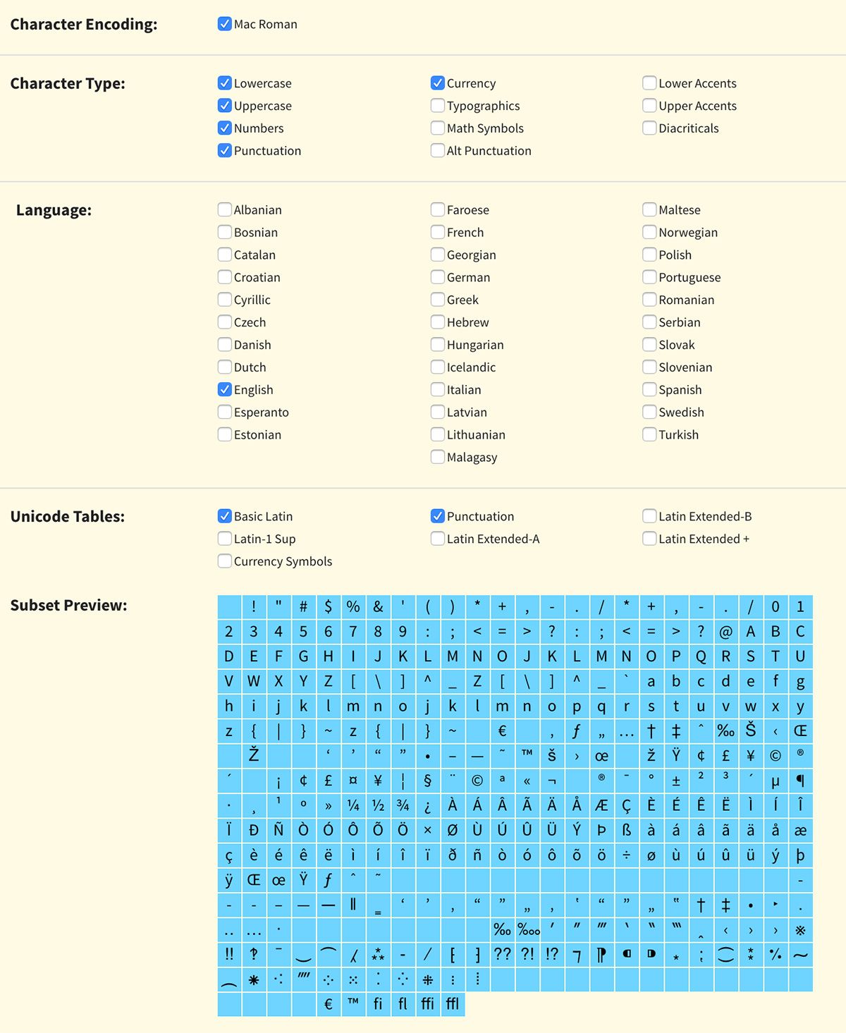
The more font families and variants you use, the bigger the payload to download and parse is going to be. When we look at our site, each variant of Klim Foundry’s Calibre font averages at 26KB. If we included the entire family, we’d be looking at 356KB in fonts alone!
Audit your font selection carefully—only include crucial variants and weights. An up-and-coming OpenType font format dubbed Variable Fonts is likely to help to mitigate this issue. The new format allows embedding multiple variants in a single file, effectively limiting the number of requests that have to be made to obtain all combinations. Go ahead and explore already available variable fonts.
However, subsetting can be tricky to implement (often relying on command-line interfaces) and error-prone if not handled with care. If you’re not comfortable with subsetting tools, pair with a developer to create an optimised webfont pack or make them aware of this strategy if they haven’t heard of it before.
Define font fallbacks#
When establishing your typography rules, create a list of fallback fonts and pass them to engineers you’re working with. Fallback fonts are defined in CSS and will be used by the browser if the primary font cannot be accessed or when using font loading strategies that display secondary fonts while waiting for the files to download.
Selecting a typeface that’s somewhat similar to your webfont will reduce layout shifts and jarring visual experience of Flash of Unstyled Text (FOUT). In case you’re curious and would like to see more examples of this behaviour, read Monica Dinulescu’s explainer on font loading.
Having an understanding of how rendering text on the web affects user experience might change your design decision making in the future. You can make informed choices that will significantly increase site speed scores.
In the next article of the series, we’ll be discussing another critical aspect of designing for speed: working with raster and vector imagery.