
Successful teams focusing on web performance use both synthetic and real user monitoring solutions to guide their efforts. But, not everyone can easily dive into real user monitoring. Installing tracking scripts, additional service costs or the ability to interpret collected data are all barriers to RUM adoption. That’s why today we released the CrUX Dashboard: a way to track real user data, without additional costs and complexity.
The CrUX Dashboard relies on Chrome User Experience Report (CrUX) data, collected by Google. While CrUX certainly has limitations (such as only collecting data for sufficiently popular sites, without iOS devices, and only for Google Chrome sessions), it’s a useful dataset for teams focusing on performance and SEO. Now, all of this data is available for you in Calibre, for no additional cost on top of existing subscriptions.
We added the CrUX Dashboard to directly address RUM adoption bottlenecks:
- Provide real user monitoring data without additional installation steps and service costs
- Help teams check metrics that contribute to their Google Search ranking
- Portray web performance trends in a way that’s easy to understand for anyone
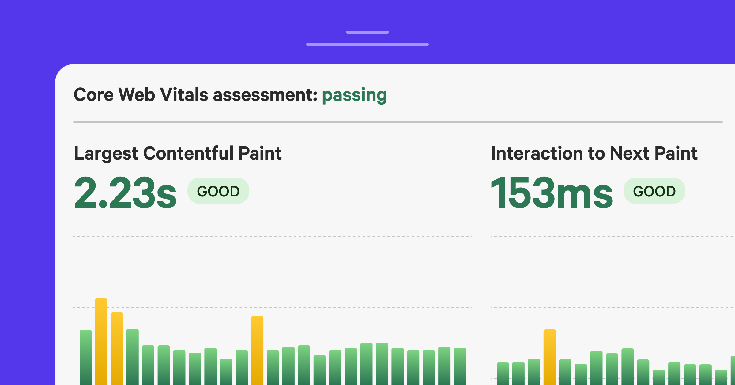
Check your Core Web Vitals assessment#
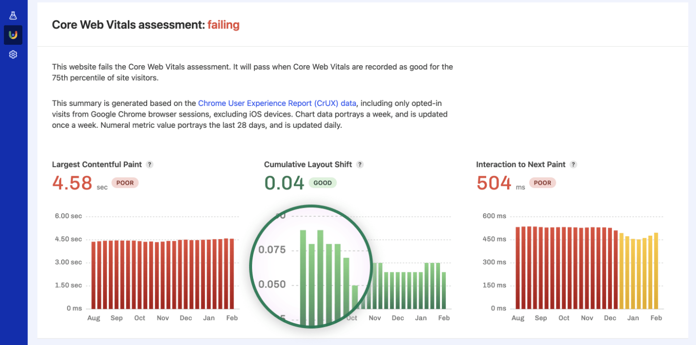
Core Web Vitals is a modern set of metrics measuring visual stability (Cumulative Layout Shift), loading (Largest Contentful Paint), and interactivity (Interaction to Next Paint). All of these aspects directly correlate to user experience, so it’s not a surprise teams are looking to the Core Web Vitals assessment as their web performance north star. If you’re familiar with our Core Web Vitals Test, this is an extended version of that free report.
The CrUX Dashboard gives your team a quick success or failure status update, with the ability to check which metrics or device groups (desktop, tablet, or mobile) need improvement:
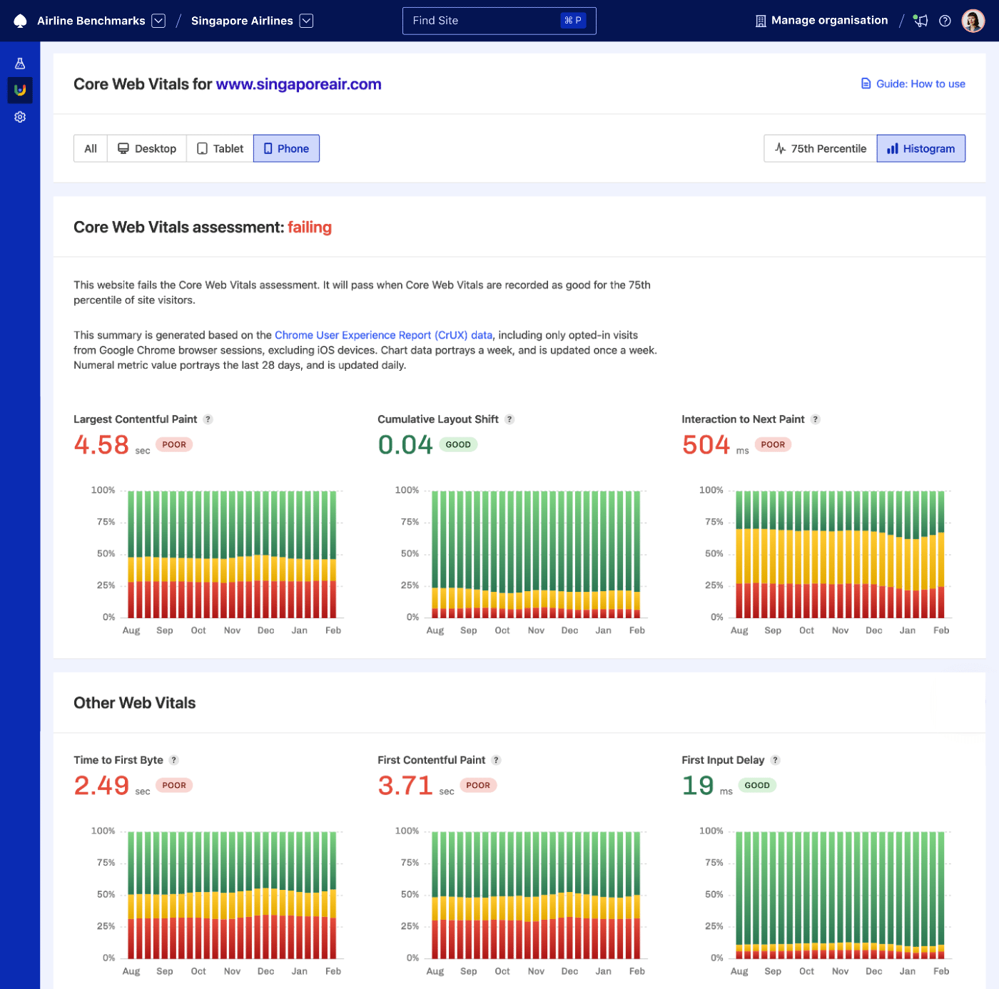
The Core Web Vitals assessment is successful when all Core Web Vitals metrics are within a good threshold (which can be easily found in the dashboard, so you don’t have to go looking what good means). A good assessment not only contributes to better UX, but also is a positive signal for Google search engine ranking.
Track Core Web Vitals trends#
While it’s useful to observe single web performance measurements when searching for reasons behind specific changes, more often than not, teams want to understand trends. Is Interaction to Next Paint going up, down, or holding steady? The 75th percentile view on the CrUX Dashboard is a great way of observing trends for the last six months:
Each chart bar corresponds to the P75 value of a selected metric, meaning that for a given week, at least 75% of sessions fall under the portrayed value. While the 75th percentile doesn’t guarantee all visitors have a good experience, it’s a helpful visualisation of a majority trend (certainly more comprehensive than a median).
Ensure good user experience#
While the 75th percentile is a good starting point for checking in on trends, it’s vital we ensure a good user experience for all visitors. This is where browsing histogram CrUX data is helpful, as it shows the percentage of good, to improve and poor experiences.
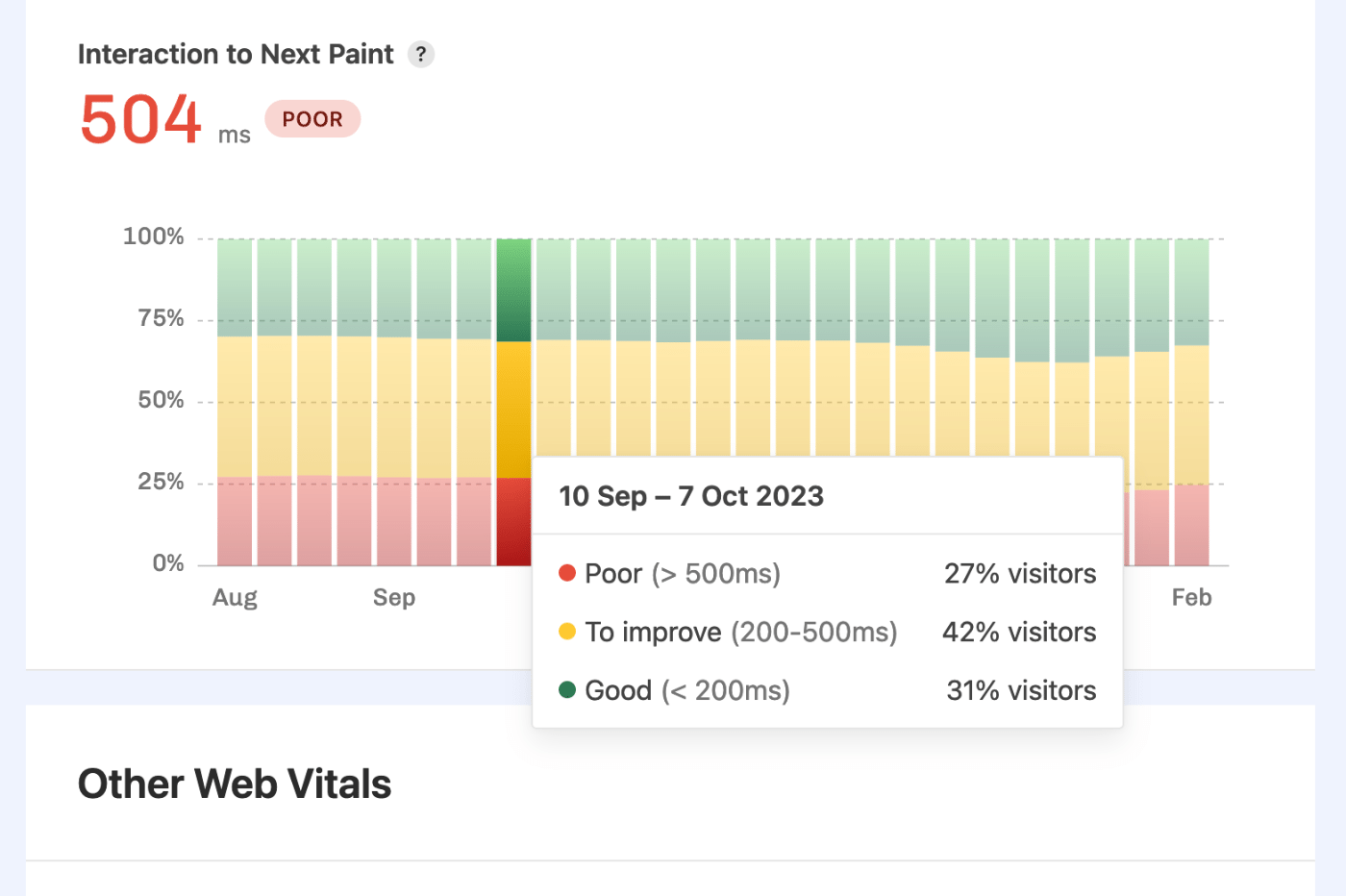
With that knowledge, coupled with the device factors, teams can focus on targeted web performance improvements for the audiences it matters most to.
If you need more details, check the CrUX Dashboard report documentation page. Are you new to Calibre? You can sign up for a free 15-day trial. Need more time? We’ll happily extend the trial period, too.