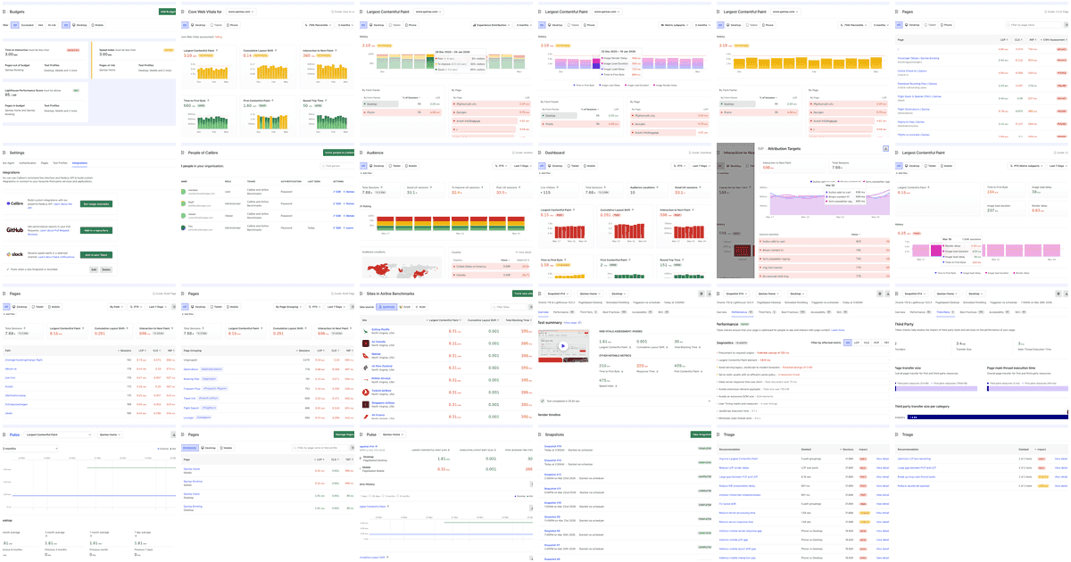

The first time I opened the output folder and saw all 585 screenshots laid out as thumbnails in Finder, my jaw dropped. I could see our entire product, all at once. Not a Figma comp. Not the app I had a mental model of. The actual product, in its actual states, in its actual themes.
Like an animator’s lightboard. You can step back and see the whole thing.
I’ll come back to that. First, how we got here.
The screenshot tax#
Keeping good quality, current screenshots of your own web product is surprisingly hard. Keeping screenshots up to date in documentation? Not today, devil.
Most products either skip screenshots in docs entirely, or you one day discover a docs page illustrated with a UI that now looks completely different.
The cost of manually maintaining a library of images in sync with a moving product across light mode, dark mode, mobile, and every account state — is simply not tenable. That’s why so many product docs don’t bother. They aren’t lazy — it’s hard, and too much work. So I thought, for years.
If you’ve ever maintained product documentation, or worked in customer support, you know the tax. Every screenshot you take is a small bet that the UI in that screenshot won’t change. You will lose this bet. You always lose this bet.
Buttons get renamed. A column gets added to a table. A new font emerges. A colour token shifts by half a step.
None of it is a big deal individually, but multiplied across hundreds of marketing and docs images, it becomes a quiet drift between the product you ship and the product you describe.
To maintain it manually is too time intensive, and riddled with inconsistencies: Someone has to open the app, find the right page, set up the right state, take the screenshot, crop it, export it, replace it — and then realise it was used in four other places that all need updating too.
Aside from that, manual one-off screenshots are never enough. The images are slightly different sizes. Fonts aren’t rendering the same. Light mode. Dark mode. Desktop. Mobile. Help!
585 screenshots, no one taking them#
Today, almost every screenshot on Calibre’s marketing site and docs is generated automatically. As of writing, there are around 585 screenshots in the set.

Our screenshots document the entire Calibre application, including all three products (RUM, CrUX & Synthetic monitoring), admin/billing pages, forms, reports and charts. Everything.
For each screenshot scenario, we capture several options:
| View | Navigation | Themes |
|---|---|---|
| Desktop full frame | Global navigation included | Light / Dark |
| Desktop sidebar collapsed | Cropped below global navigation | Light / Dark |
| Desktop content only | No navigation visible | Light / Dark |
| Mobile full frame | — | Light / Dark |
Having light and dark mode screenshots allows us to automatically display a light or dark mode screenshot, based on user preference.
There is generated data for numerous user scenarios, like new signups, enterprise accounts, sites with no performance data, sites with lots of performance data, and everything in-between. And now? We have a system to generate it all. Right now, that’s a set of 585+ images, generated in just a few minutes.
From seed to screenshot#
We’ve learned a lot about browser automation in the years developing Calibre’s synthetic testing product (based on Chrome, deployed to 17-global locations). During this time, browser automation has rapidly improved and is now a fairly trivial task.
I knew from the outset that the dream scenario would be to automatically capture screenshots of almost every page in the application. Screenshots would feature generated example content only, and would include as many different account scenarios as I could think of.
Turns out, we already thought of these scenarios — for years. Since day one, all Calibre’s code repositories have included a script called script/bootstrap. The bootstrap script is one command to go from "just checked out the repo" to "I can work on this now". It’s been a valuable process to adhere to, and it’s paid many dividends.
For our main application, that means bootstrap runs db/seeds.rb, filling the local development database with mock data. Seeds generates mock data for several account scenarios:
- New trials,
- Starter/Team/Company plan tier accounts,
- Accounts with paused or lapsed billing,
- A demo account with lots of performance data,
- …and a whole lot of other variations.
In development, we’ll login as a specific account, and enjoy having full, real looking generated data as we build and improve the product.
With a freshly seeded local app, we used Playwright’s @playwright/test to specify and run our multitudes of scenarios.
Using playwright allowed for powerful configuration in playwright.config.js that lightened the setup effort:
- Specify Chrome emulation settings for Desktop and Mobile viewport sizes
- Define
projectsfor light & dark modes, navigation expanded, navigation collapsed, and mobile - Include a helper to login to the app
- Turn on test runner parallel mode, using 10 headless browser tabs
- Set action, request and failure timeouts, to manage failures
Then, each screenshot was a single test case:
import { test } from "./fixtures/base";
import {
	waitForPageReady,
	takeScreenshot,
	takeElementScreenshot,
	hoverOverChart,
	isMobile,
	isNavCollapsed,
} from "./helpers/screenshot";

const BASE = "/teams/airline-benchmarks/qantas";

test.describe("RUM Screenshots", () => {
	test("rum-dashboard", async ({ page }, testInfo) => {
		await page.goto(`${BASE}/rum/dashboard`);
		await waitForPageReady(page);
		await takeScreenshot(page, "rum-dashboard", testInfo);
	});

	test("rum-pages", async ({ page }, testInfo) => {
		await page.goto(`${BASE}/rum/pages`);
		await waitForPageReady(page);
		await takeScreenshot(page, "rum-pages", testInfo);
	});

	// etc etc
});
To keep test cases thin and straight-forward, we used helpers like takeScreenshot to snap a screenshot, convert to .webp and write to playwright-tests/screenshots/.
The filename convention describes the product, feature, mode, view and colour theme. e.g.: RUM Dashboard Desktop, no navigation, dark mode is rum-dashboard-desktop-content-dark.webp.
A bit over 80 scenarios, each rendered 7 ways, gets us to roughly 585 screenshots. With Playwright’s parallel processing using 10 browser tabs, the whole process takes just a couple of minutes.
The accidental lightboard#
We built the screenshot pipeline to have a reliable, up-to-date library of images for documentation and marketing. The goal was to have a directory full of screenshots that would always have an image that was ready to use, and mass update them whenever we made a change to the UI.
Once we had a directory of images. I started to flick through them in Finder. With this bird's eye view, I started seeing things.
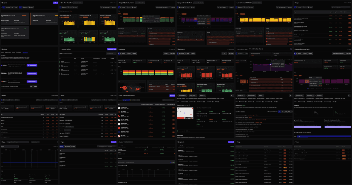
Inconsistencies, layout shifts, margins, and subtle differences between pages. All easy to miss when you’re distracted and navigating around a page, but glaringly obvious when you see them all together.
I quickly realised that there were small changes that could be made to improve overall UI quality that would not take a lot of effort. Global fixes to margins, font sizes, spacing and alignment that made a big difference to the overall polish of the product.
Using Finder preview, I could arrow up and down quickly through screenshots, and see the whole product at once.
Using search, I could query by product area, light/dark mode, or account state, and immediately review all the screenshots that matched that criteria. I could see patterns, and quickly identify areas that needed visual review and improvement.
With this new perspective, many small UI improvements have landed. It has since been easier to maintain a higher level of visual consistency across the product.
We were able to confidently ship dark mode across the entire product in one go, knowing that there was a system to review and maintain it.
The new Real User Monitoring product arrived at the same time. The product feels stable, there are no awkward layout shifts, and it’s visually consistent on the whole.
This process also made it easier to actively improve the underlying components as the new product was completed. Another great trick in the bag.
If you want to see the screenshots in their natural habitat, they’re scattered across our docs and the product pages.
Every seam, aligned.